
KobalteComponent Library
Unstyled, accessible SolidJS primitives with composable APIs and data attributes for custom styling.
Unstyled, accessible SolidJS primitives with composable APIs and data attributes for custom styling.
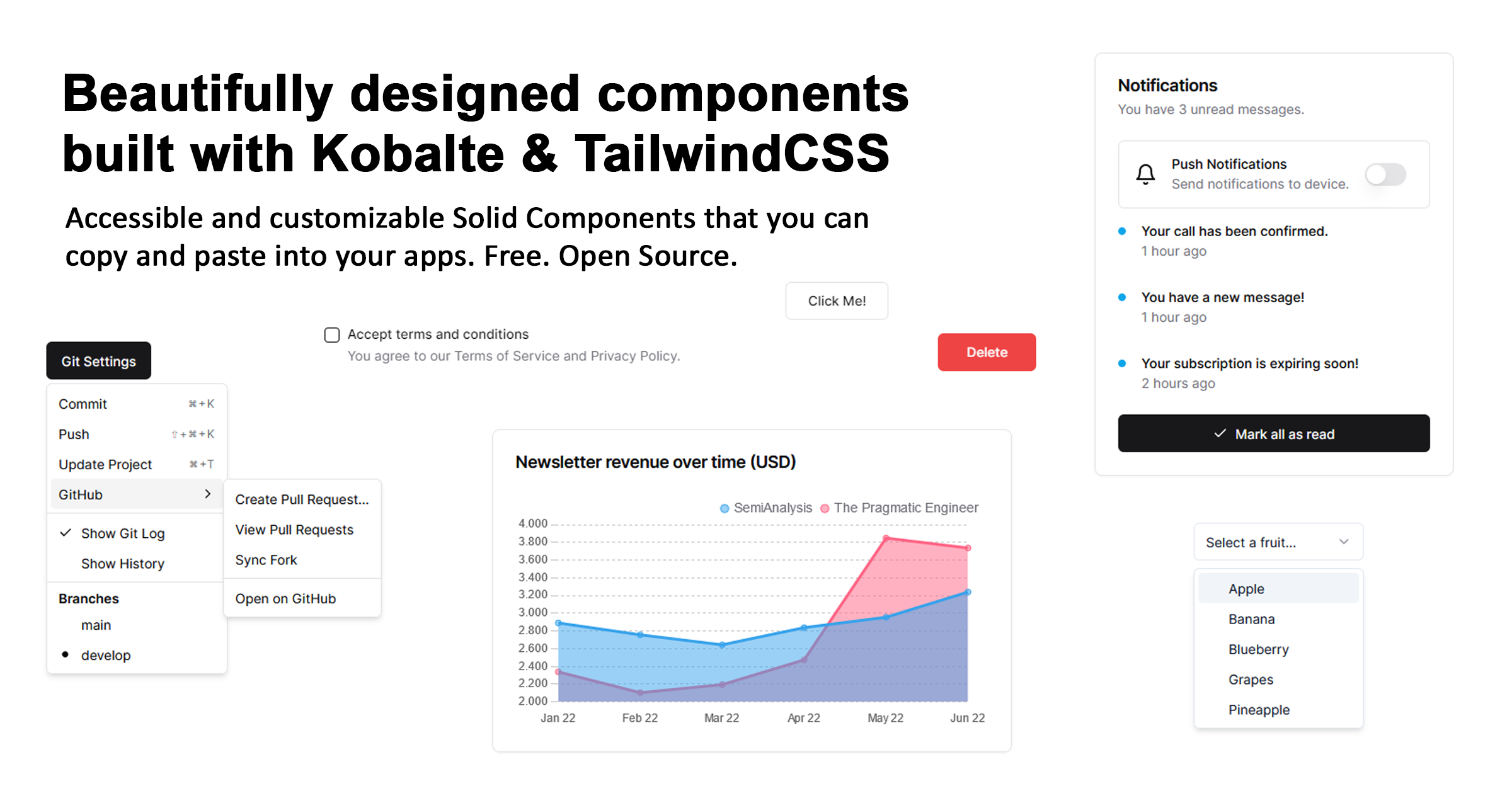
Copy-and-paste SolidJS components ported from shadcn/ui and Tremor, styled with Tailwind CSS.
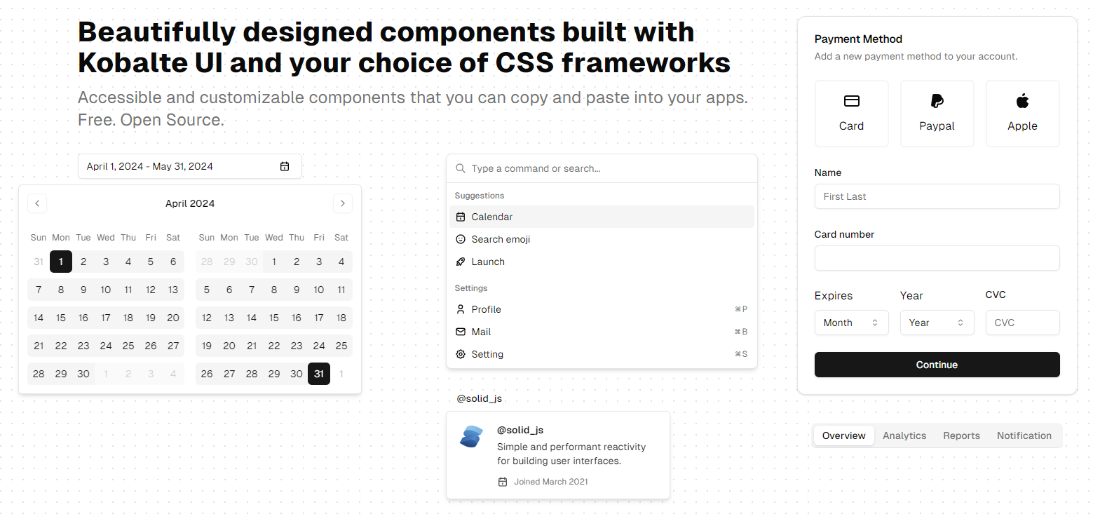
A SolidJS port of shadcn/ui with copy-and-paste components built on Kobalte and styled with Tailwind CSS.
A shadcn-compatible registry of SolidJS components built on Kobalte and Corvu, with selectable Tailwind CSS themes.
Themeable SolidJS 2 components with Tailwind CSS v4 presets, available as an early source preview.
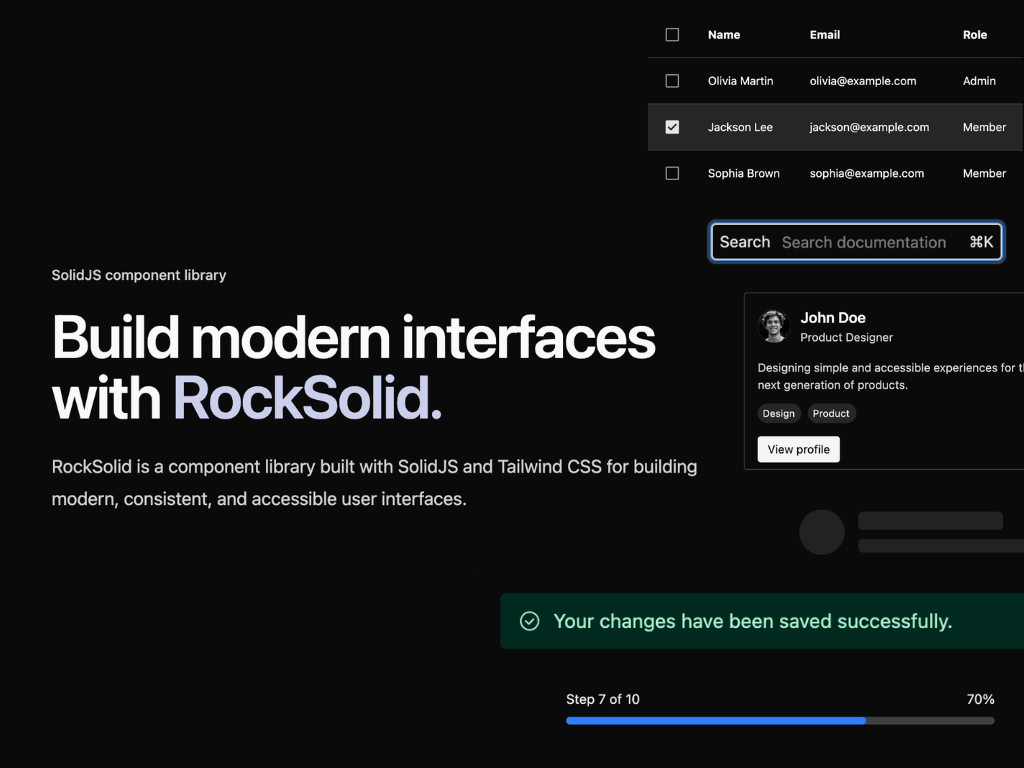
Styled SolidJS components with Tailwind CSS, theme customization, and RTL layout variants.

Copy-paste SolidJS components and reactive primitives with Tailwind CSS v4 themes and a Tauri desktop suite.
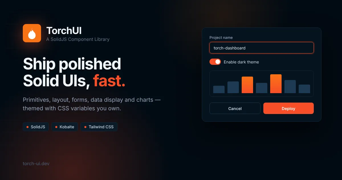
Styled SolidJS components built on Kobalte with Tailwind CSS themes, light and dark modes.
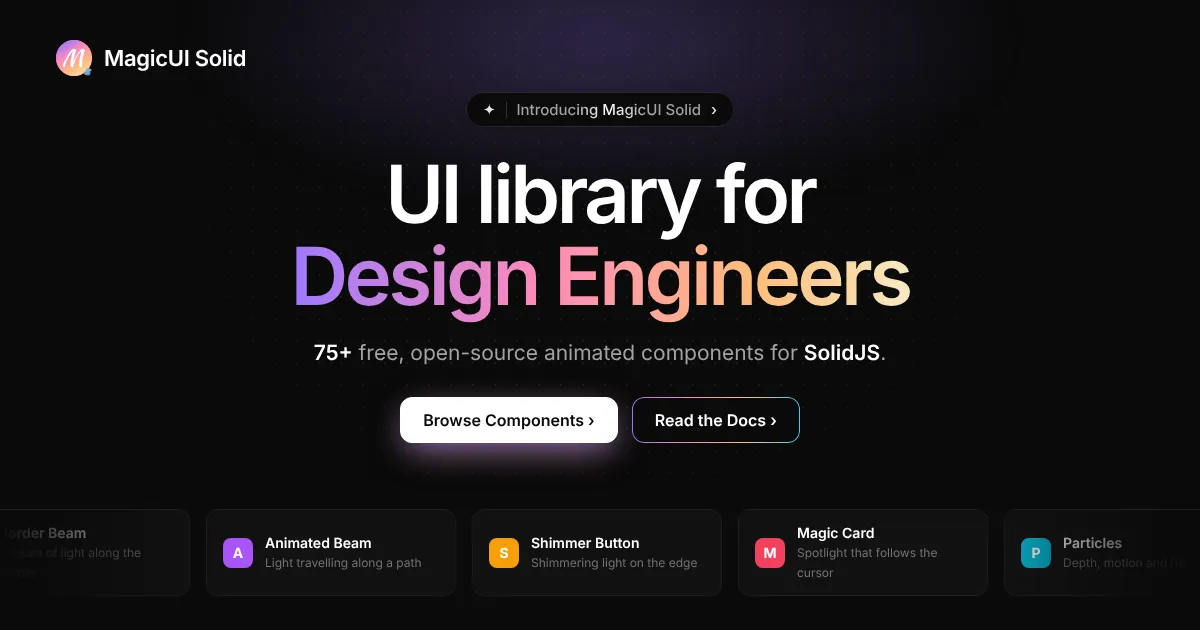
A SolidJS port of Magic UI with copy-paste animated components and a shadcn-compatible registry.
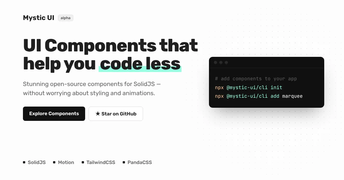
Alpha copy-paste animated SolidJS components with separate Tailwind CSS and Panda CSS variants.
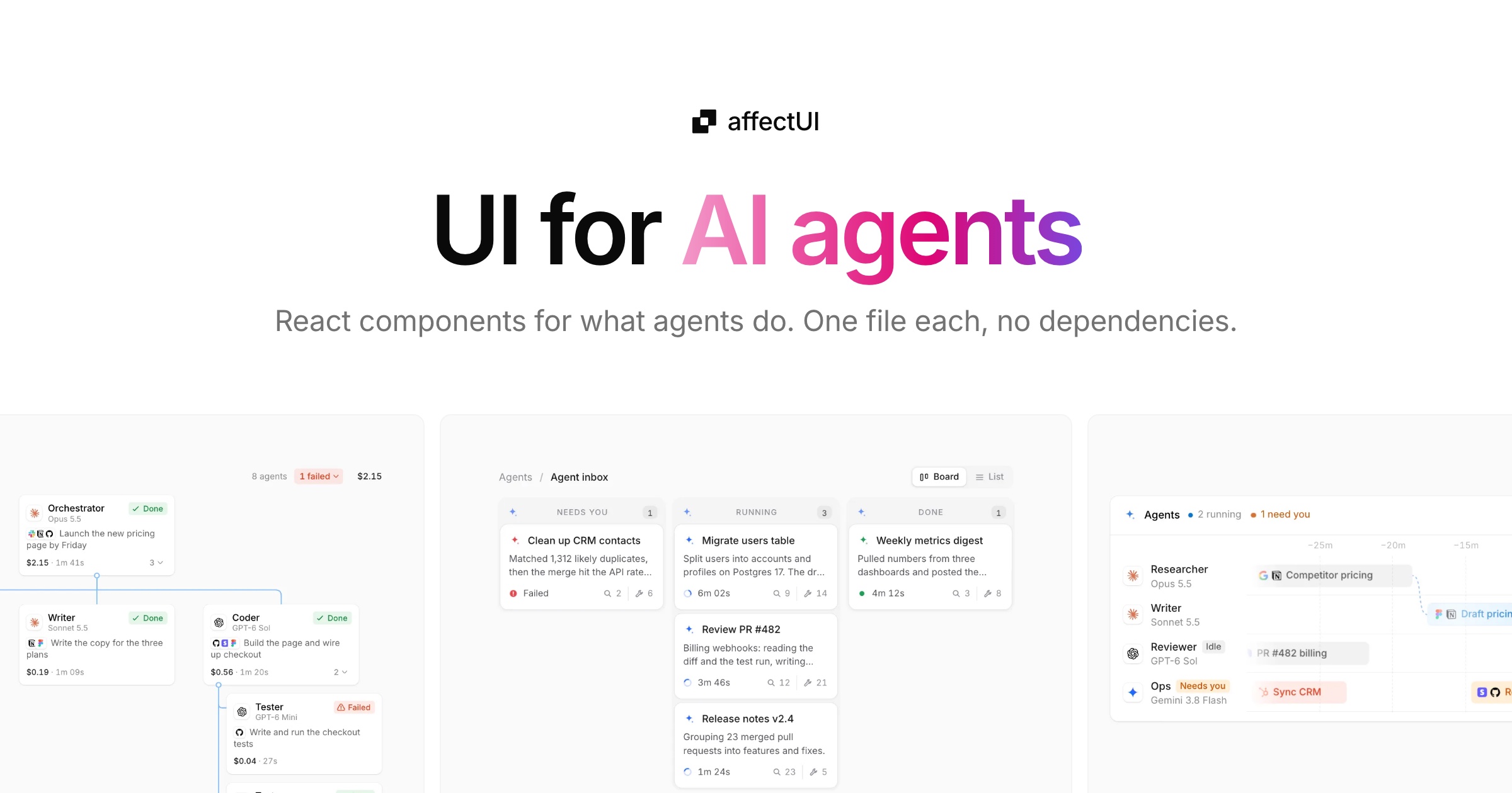
React components, screens, blocks, illustrations, and motion effects for AI products and SaaS, each a single dependency-free .tsx file installed through the shadcn CLI.
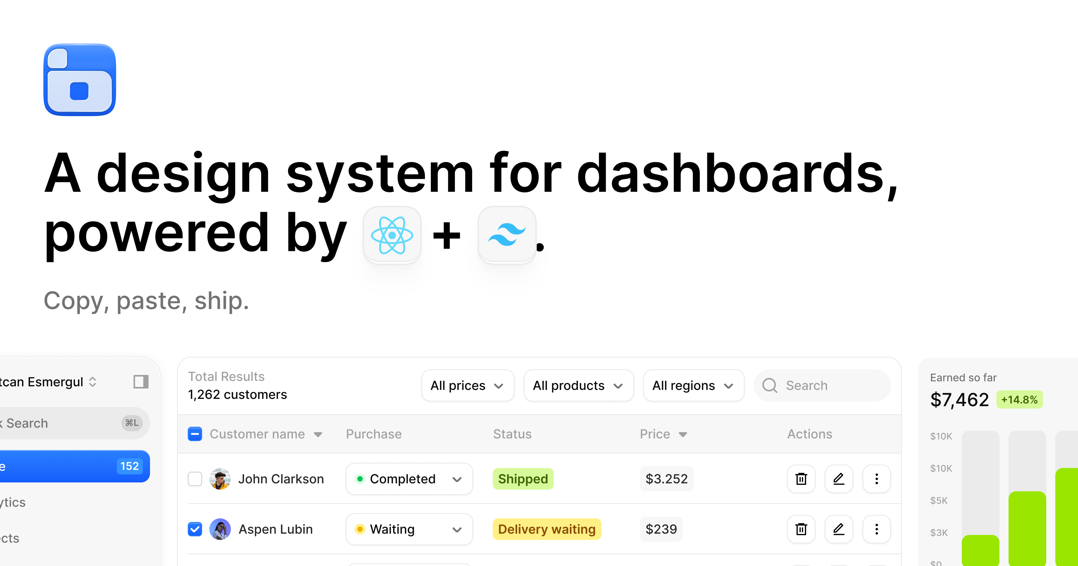
React and Tailwind CSS components, charts, and templates for dashboards and AI interfaces, distributed as editable source files.
Unstyled, accessible components and headless primitives for SolidJS 2, with composable APIs inspired by Base UI.
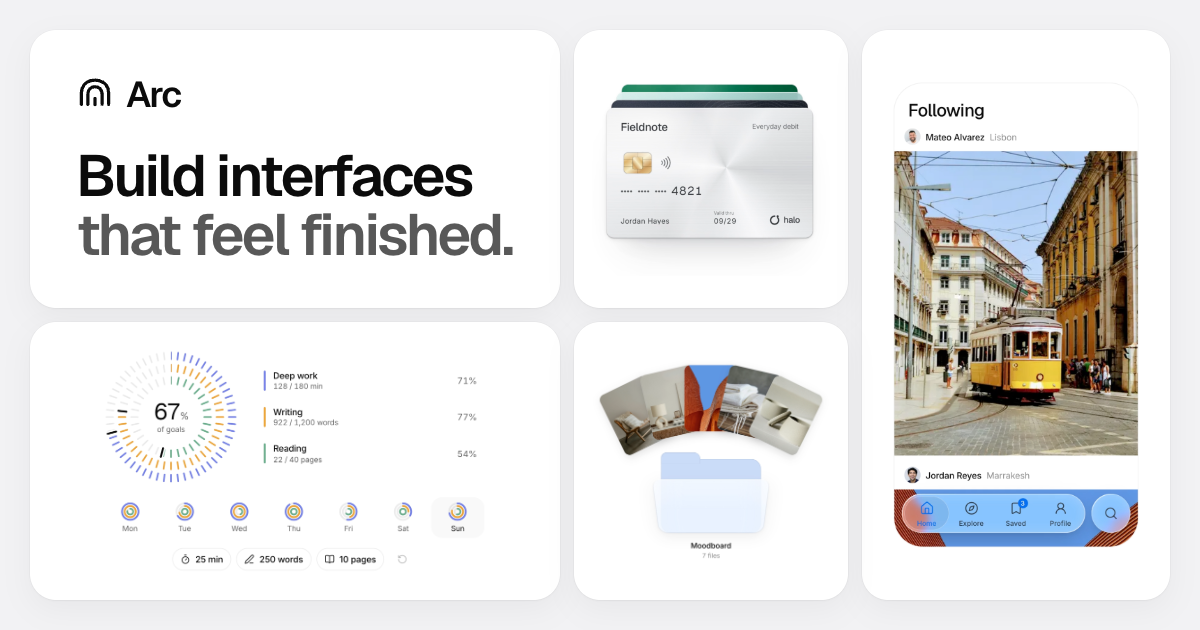
React components and blocks with motion, CSS modules, and shared theme tokens, installed through the shadcn CLI or copied as source.
A marketplace of production-ready React components built by the community, installable in one command.
Animated, interactive React components, from text effects and backgrounds to small micro-interactions.

Copy-and-paste UI transitions for web apps, with a skill for coding agents.
Editable React components styled with Tailwind CSS, with Base UI, Radix UI, and React Aria implementations.
More than 150 free animated components and effects for landing pages, built with React, TypeScript, and Tailwind CSS.
Animated components and page sections for modern websites, including hero effects, 3D cards, and scroll-driven experiences.
A production-ready animation library for React and JavaScript, formerly known as Framer Motion.
A widely used JavaScript animation library with timelines, ScrollTrigger, and physics-based motion.
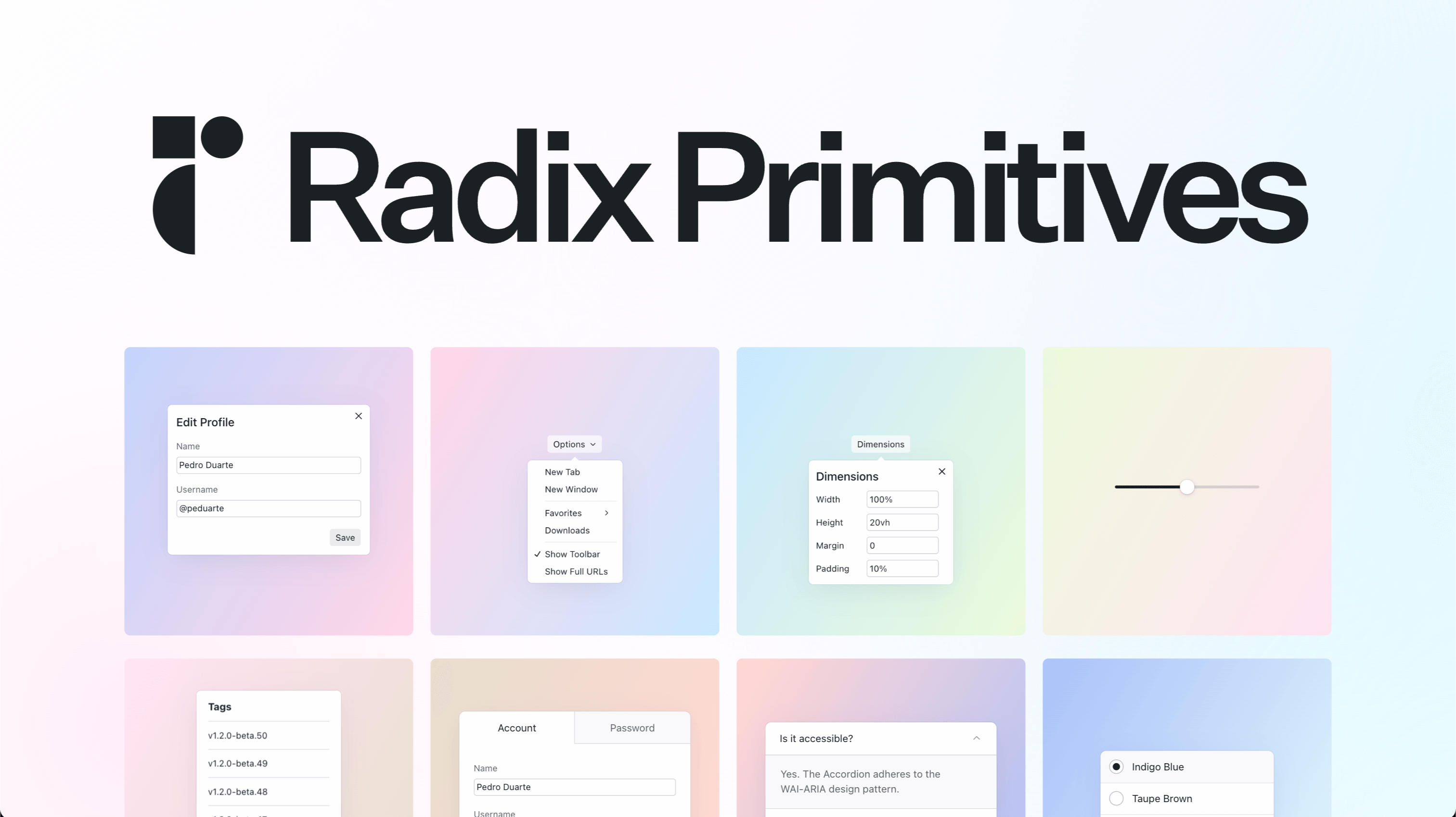
Unstyled, accessible primitives for building high-quality design systems and web apps in React.
Unstyled, accessible React components from the creators of Radix, Floating UI, and Material UI.
Unstyled React components with accessible interactions, internationalization, and composable APIs from Adobe.
A modern React UI library with built-in theming, formerly known as NextUI.

A fully featured React component library with 100+ components, hooks, and native dark theme support.
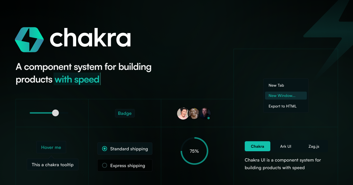
A simple, modular and accessible React component library with a style-props API.

A React implementation of Google's Material Design with a large ecosystem of components and tools.

An enterprise-focused React design system with a broad set of components.
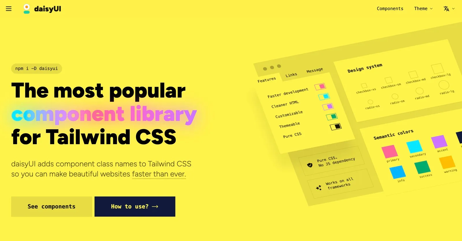
A Tailwind CSS plugin that adds semantic component classes such as btn and card, with no JavaScript required.

Open-source components built on Tailwind CSS, with versions for React, Vue, Svelte and Angular.
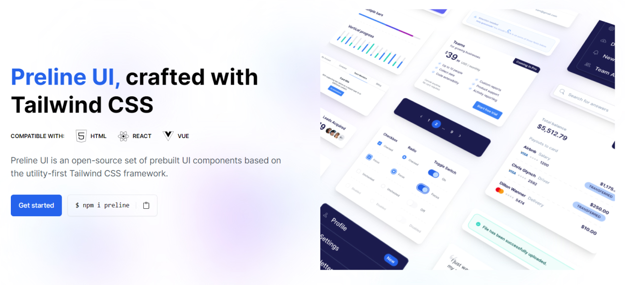
Open-source Tailwind CSS components with matching Figma files, covering marketing, e-commerce, and application UI.
Free, unstyled Tailwind CSS components for marketing, e-commerce and application interfaces.

Copy-and-paste React components built on Base UI and Tailwind CSS, formerly Origin UI.
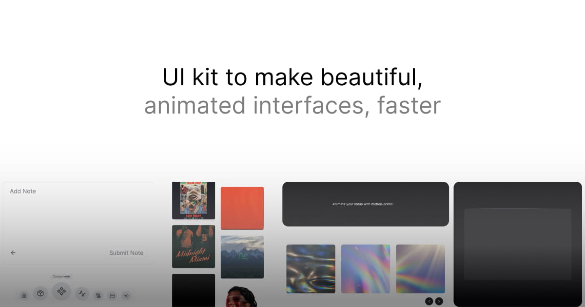
Animated components built on Motion that you copy into your project and adjust to fit.

Hand-crafted animated components and interaction experiments for React and Tailwind.
A consistent, open-source icon set that began as a community fork of Feather Icons, with packages for most frameworks.
A composable, React-native charting library built on SVG components.
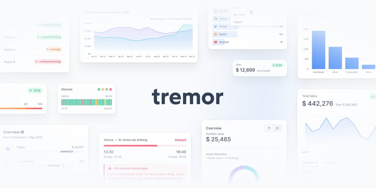
React components for dashboards, including charts, KPI cards, and data displays, styled with Tailwind CSS.
A React renderer for Three.js that lets you build 3D scenes and WebGL experiences as components.
A Svelte port of shadcn/ui with accessible components you copy straight into your Svelte app.
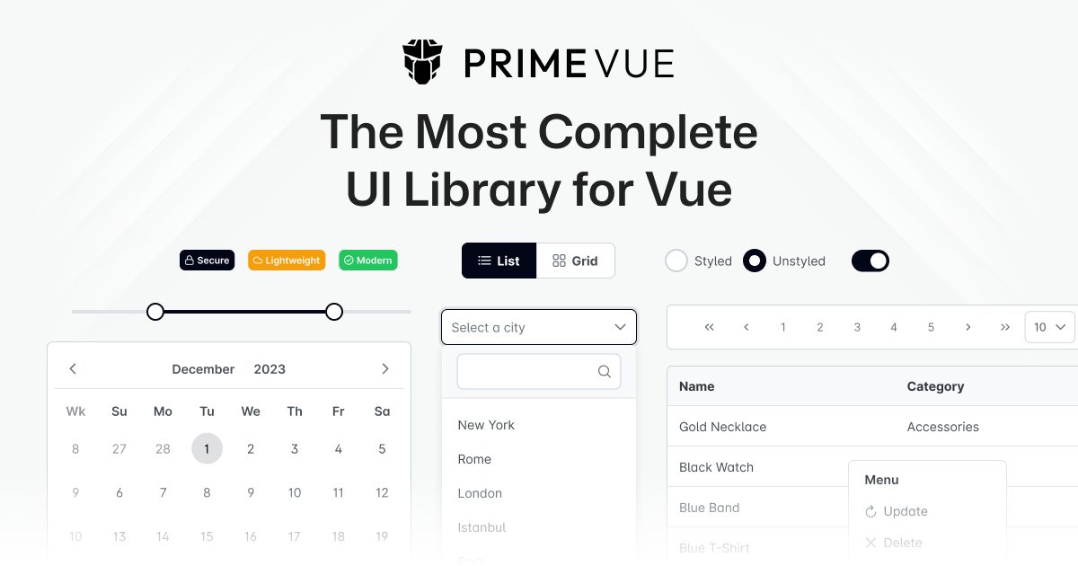
A large UI component suite for Vue with more than 90 components, plus ready-made themes and blocks.

Interactive React components for layouts, navigation, and polished UI interactions.
React components with Tailwind styling and motion for accessible interfaces.
React components and effects built with TypeScript, Tailwind CSS, and motion.
Copy-ready React components, blocks, and templates for landing pages.
Interactive UI blocks you can preview, adjust, and copy as code.

Open-source animated React components that install through the shadcn CLI.

Animated React components built with Tailwind CSS and Motion.
A gallery of interaction and motion details from real products for design inspiration.
Headless, accessible components for React, Vue, Svelte, and Solid design systems.
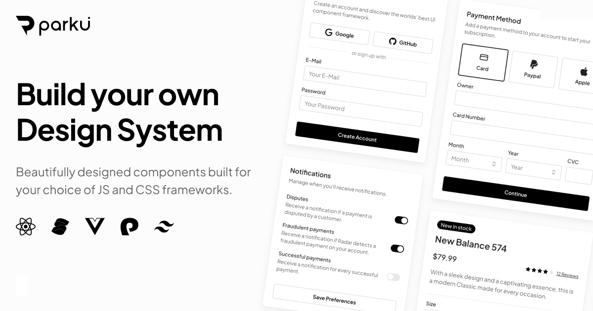
Styled, customizable design system components built with Ark UI and Panda CSS.
Unstyled, accessible components for React and Vue from the Tailwind CSS team.
A utility-first CSS framework for building custom interfaces directly in markup.

Composable components and blocks distributed through a shadcn-compatible registry.
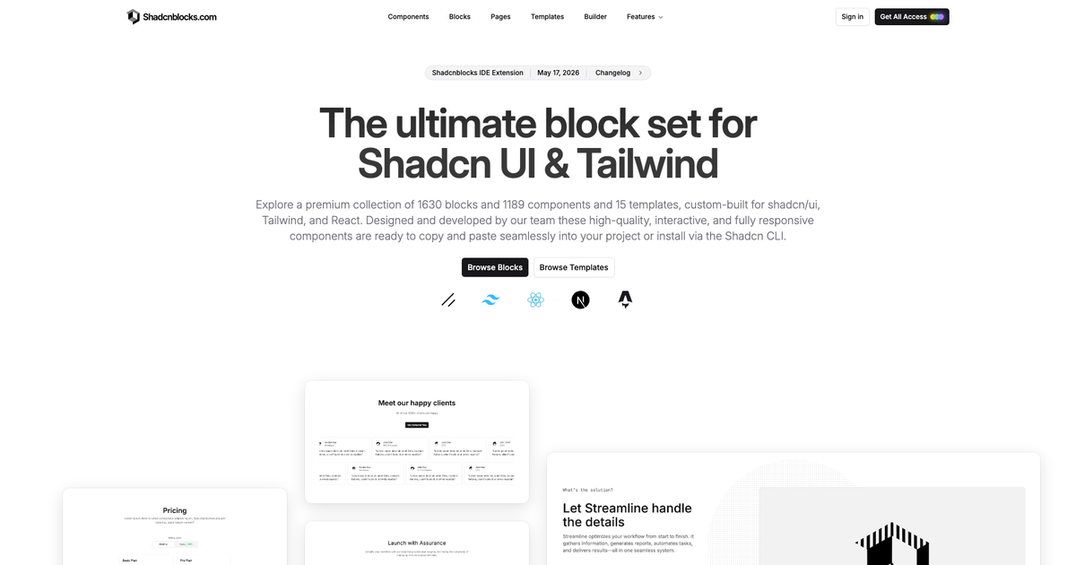
Ready-made page sections, components, and templates for shadcn/ui projects.
Marketing sections and components for shadcn projects, with Radix and Base UI variants.
Playful React components and interactions, including physics-based Gravity effects.

JavaScript animation engine for DOM, SVG, CSS, and timelines.
Spring-based animation tools for interactive React interfaces.

Smooth scrolling library for websites and scroll-driven experiences.
Create interactive animations and run them across web and native apps.

A compact animation format and players for Lottie animations.
Open-source motion components for React and shadcn/ui projects.
Open-source React components, blocks, and layouts for web apps.
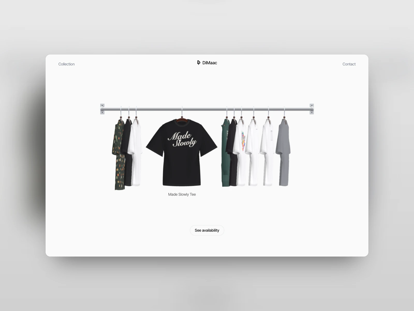
Animated React components for galleries, cards, scrolling, and text effects.
Animated React components for shadcn/ui projects.
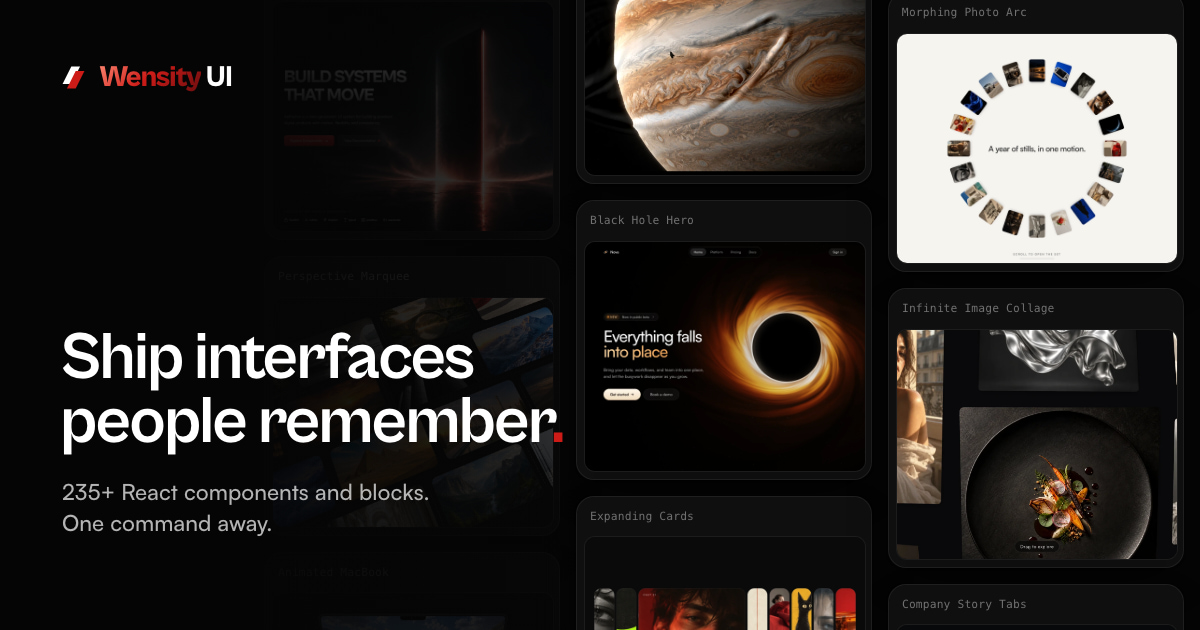
React components, blocks, and templates installed as source through the Wensity CLI.
A React component registry with previews and agent-assisted installation.
CSS components, motion examples, generators, and frontend tools.
Accessible React components built with React Aria and Tailwind CSS, installed as editable source.
React components and patterns for shadcn/ui projects, with Base UI and Radix UI variants.
React components for audio players, waveforms, transcription, and voice agent interfaces.
Animated Vue and Nuxt components for text effects, backgrounds, and interactive websites.
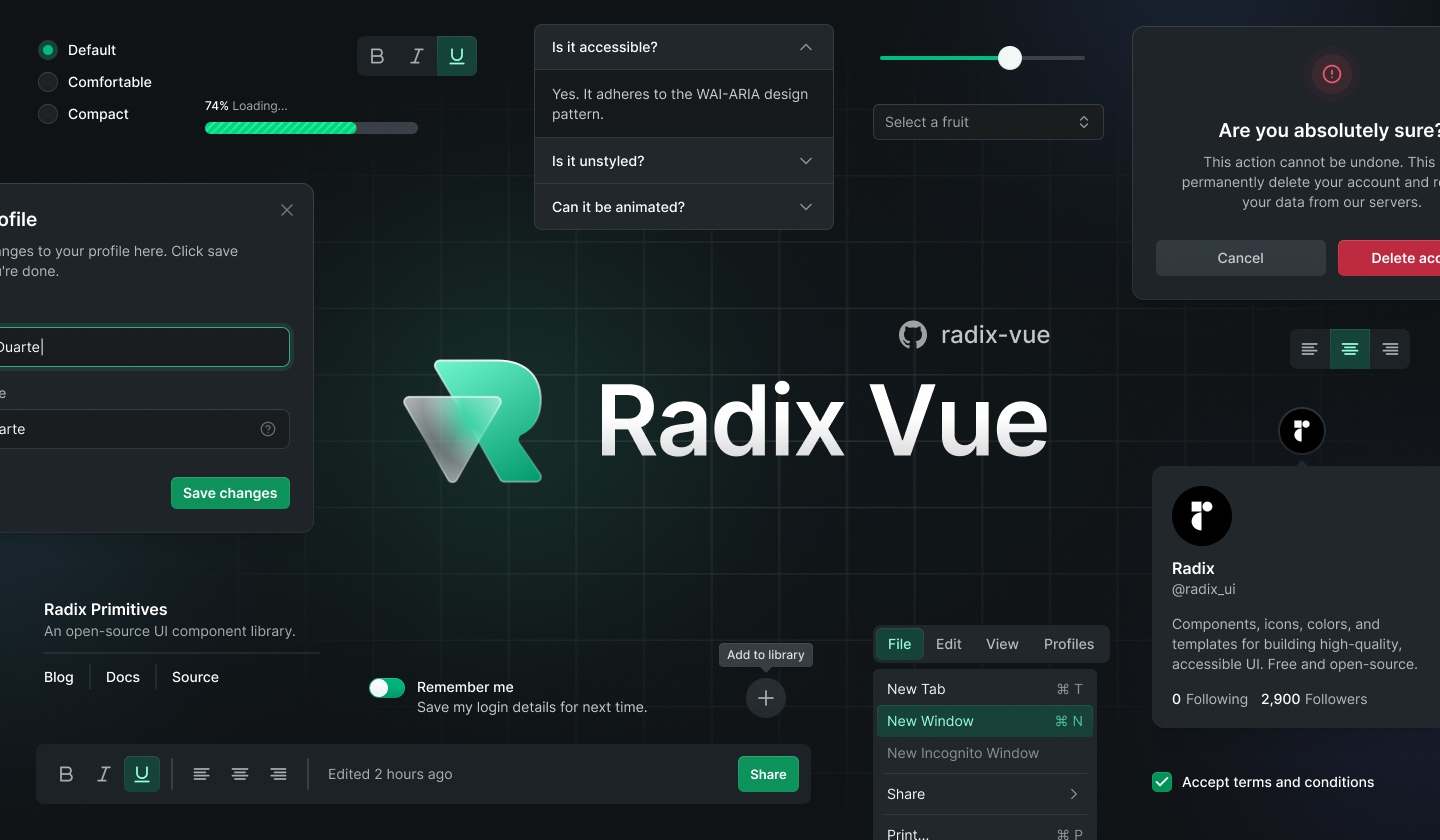
Unstyled, accessible Vue primitives for custom design systems, formerly Radix Vue.
Headless, accessible builders and component wrappers for Svelte 5, using the next-generation melt package.
Accessible Angular components styled with Tailwind CSS and copied into your project through a CLI.
Accessible Angular primitives with editable Tailwind styles, split into brain behavior and helm components.

Unstyled, accessible SolidJS primitives for overlays, calendars, drawers, and resizable layouts.
Editable Tailwind components for Astro and React, with Vue and Svelte adapters in public beta.
Configurable components, blocks, and templates for Astro, Svelte, and React, styled with Sass.

Framework-independent web components from Font Awesome, with built-in themes and React wrappers.
A command menu React component that can also be used as an accessible combobox: items filter and sort automatically behind a fully composable API.
A plug-n-play React component for a fast, portable, and extensible command + k interface, with keyboard navigation, shortcuts, nested actions, and screen-reader support.

A gallery of interfaces and motion captured from real products, plus animated React components installed with the Morphin CLI.

Copy-and-paste animated React components and Next.js templates built with Tailwind CSS and Motion, added with the Viora CLI.
GSAP and CSS animated React components and page blocks installed as editable source through a shadcn registry.
Animated, interactive React components and page-section blocks installed through a shadcn registry.
Hand-coded vanilla HTML, CSS and JavaScript components and interactions to copy, plus an archive of notable site designs.
Animated React components, blocks and templates with spring-physics motion, installed through a shadcn registry.

A gallery of motion videos made with Claude Opus 5.5, each with the prompt behind it.
A shadcn/ui registry of animated React buttons built with Tailwind CSS and Motion.
Zero-dependency hand-drawn UI controls for vanilla JavaScript and React, sketched fresh on every mount.
A browsable library of screens, flows and paywalls from top-grossing iOS apps, with an MCP server for agents.

A hand-crafted SVG icon set in round or sharp, line or solid variants, with 300 icons free on npm.
An open-source collection of 468+ animated React icons based on Lucide, installed one at a time with the shadcn CLI.

An animated icon library of 48,100+ Lottie icons, with free player packages for the web and React.
A free library of 298 animated Lottie icons for React, shadcn/ui, plain lottie-web, iOS and Android.

A searchable index of 380,000+ SVG icons from 238 open-source packs, with copy as SVG or JSX.
Animated copy-paste React components built with Motion and Tailwind CSS, installed through the shadcn registry.
An icon library of 60,000+ icons in 10 styles, with 6,000+ free Stroke Rounded icons under MIT and Pro tiers for teams, packaged for React, Vue, Svelte, and more.
An open-source icon set of 900+ icons in five styles — outline, duotone, fill, pixel, and glass — with a browser editor and 1,100+ brand logos, packaged for React, Vue, Svelte, and Astro.
A curated collection of React micro-interactions, transition components, and card layouts powered by Motion and Tailwind CSS.

An open-source collection of animated, interactive Svelte components for building memorable websites.

Creative html-in-canvas components with WebGL or WebGPU effects; full HTML effects require Chrome's experimental API via a flag or origin trial, with normal HTML fallbacks elsewhere.
A lightweight React library of loading indicators, such as Arc, Classic, and Comet, installable from npm as loading-dev.
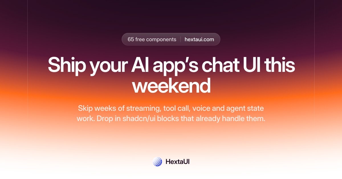
Open-source React components and hooks built on Base UI and Tailwind CSS v4, installed through the shadcn CLI, with AI chat components and loading, empty, and error states handled.
Live, animated gradient backgrounds and surfaces for React, rendered with WebGPU or WebGL2 and installed as editable source through the shadcn CLI.
Open-source bilingual Arabic and English toolkit for Gulf products: agent skills, @dualkit/format for Gulf currencies, Umm al-Qura dates, phones and IBANs, eight right-to-left aware React components, and a CLI that checks pages for Arabic and RTL bugs.
A dither engine and agent skill for shadcn projects that lets a coding agent build dithered backgrounds, charts, and interface pieces in your theme, installed through the shadcn CLI.